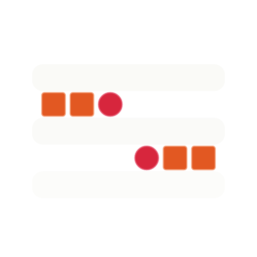
Brand

Shelfer

Brand assets.

Marks, wordmarks, colors, typography, and platform icons. Use the approved files below and follow the usage rules at the bottom of the page.

Primary marks

Icon and wordmark.

Alternating x3 mark on three emerald shelf bars, with vermilion squares and cherry circles. Use the icon for compact applications; use the wordmark for primary external identity.

Shelfer mark - alternating x3

What the mark means

Products on shelves. And an S.

  • Three emerald bars are shelves. The vermilion squares and cherry circles between them are products earning placement on those shelves - the core thing Shelfer helps brands do.
  • Read together, the items trace an S-curve diagonally across the mark - upper-left to lower-right - quietly forming the first letter of SHELFER. It's a detail you may not catch on first look, and that's the point.
Shelfer icon (emerald, for light surfaces)

Icon - light surface

SVG + PNG (512)

Emerald mark for use on bone or other light surfaces.

Shelfer icon (bone, for dark surfaces)

Icon - dark surface

SVG + PNG (512)

Bone-bar mark for use on emerald or other dark surfaces.

Shelfer wordmark (emerald + gray, for light surfaces)

Wordmark - light surface

SVG + PNG (760x160) - Outfit

Icon plus SHELFER wordmark with emerald SHELF + gray ER. Primary external lockup on light surfaces.

Shelfer wordmark (bone + gray, for dark surfaces)

Wordmark - dark surface

SVG + PNG (760x160) - Outfit

Icon plus SHELFER wordmark with bone SHELF + gray ER. For emerald or other dark surfaces.

Web & app icons

Favicon and platform icons.

The SVG favicon is the canonical source. Two tile colorways: the default bone tile (recommended for most surfaces, including iOS home screen) and an emerald tile for cases where the bone tile blends into a light UI. Per the brand spec, icons under 96x96 are shown at their native pixel size in the preview.

Favicon SVG

Favicon SVG

Scalable - primary

Modern browsers and tabs use this. Canonical source of every other size.

Favicon ICO

Favicon - ICO

Multi-resolution (16/32/48)

Legacy browser fallback. Packs three sizes into one file.

Favicon 16 preview (rendered from SVG)

Favicon 16

16x16 PNG

Standard-DPI browser tabs.

Favicon 32 preview (rendered from SVG)

Favicon 32

32x32 PNG

Standard-DPI tabs and bookmarks.

Favicon 48 preview (rendered from SVG)

Favicon 48

48x48 PNG

Windows site tile fallback.

Favicon 64 preview (rendered from SVG)

Favicon 64

64x64 PNG

High-DPI tab fallback.

Favicon 96 preview (rendered from SVG)

Favicon 96

96x96 PNG

High-DPI taskbar and shortcuts.

Apple touch icon preview (rendered from SVG)

Apple touch icon

180x180 PNG

iOS home screen.

Android 192 preview (rendered from SVG)

Android icon 192

192x192 PNG

Android home screen, PWA launcher.

Android 512 preview (rendered from SVG)

Android icon 512

512x512 PNG

PWA splash and adaptive icon source.

Maskable icon preview (rendered from SVG)

Maskable icon 512

512x512 PNG

Android adaptive icon mask source.

Dark tile variants

Emerald background, bone bars + accent mark.

For light-mode browsers, light surfaces, or anywhere the default bone tile would visually blend in. Same alternating-3 mark inside; just an inverted tile colorway.

Favicon SVG

Favicon SVG - dark

Scalable - primary

Emerald-tile version of the canonical favicon.

Favicon 16 preview (rendered from SVG)

Favicon 16 - dark

16x16 PNG

Standard-DPI browser tabs.

Favicon 32 preview (rendered from SVG)

Favicon 32 - dark

32x32 PNG

Standard-DPI tabs and bookmarks.

Favicon 48 preview (rendered from SVG)

Favicon 48 - dark

48x48 PNG

Windows site tile fallback.

Favicon 64 preview (rendered from SVG)

Favicon 64 - dark

64x64 PNG

High-DPI tab fallback.

Favicon 96 preview (rendered from SVG)

Favicon 96 - dark

96x96 PNG

High-DPI taskbar and shortcuts.

Apple touch icon preview (rendered from SVG)

Apple touch icon - dark

180x180 PNG

iOS home screen.

Android 192 preview (rendered from SVG)

Android icon 192 - dark

192x192 PNG

Android home screen, PWA launcher.

Android 512 preview (rendered from SVG)

Android icon 512 - dark

512x512 PNG

PWA splash and adaptive icon source.

Maskable icon preview (rendered from SVG)

Maskable icon 512 - dark

512x512 PNG

Android adaptive icon mask source.

Colors

G2 Emerald palette.

Emerald is the lead; vermilion is the primary accent; cherry is the rare hot signal. Use bone and ink for structure. Click any swatch to copy the hex.

Lead + accents

Surfaces & structure

Decision rule:emerald owns the brand (logo, headings, brand moments). Cherry is the single conversion color - reserved for “Readiness Review” CTAs and other primary calls-to-action. Vermilion handles secondary accents (hero phrase highlights, eyebrow dots, supporting badges). One conversion CTA per section maximum; never use cherry on more than one element in a single viewport.

Typography

Two families.

Outfit carries display, headings, and the wordmark. Geist Sans carries everything else. Geist Mono for code, tags, and tabular metadata.

Display / Headings

Outfit
SHELFER

Get on shelf. Fund the growth in between.

Geometric variable sans by Outfit Mode. Used at all display sizes, all page headings, and the locked wordmark (SHELF bold emerald + ER regular gray, small-caps).

Body / UI

Geist Sans + Geist Mono

The operating layer that connects ecommerce, retail, affiliate channels, and working capital, so the pieces stop fighting each other and your brand actually moves.

Body copy, navigation, forms, labels, captions. Geist Sans regular for body, medium for emphasis, semibold for headings that don't need the display treatment.

GEIST MONO 12px for tags, kickers, dimensions, and tabular metadata.

Usage rules

What to do, what not to do.

Do

  • Prefer SVG whenever supported.
  • Preserve clear space equal to one bar height around the mark.
  • Use the light variant on bone and other light surfaces; use the dark variant on emerald and other dark surfaces.
  • Keep brand colors intact (emerald #0f7b4c, vermilion #e25822, cherry #d7263d).
  • Scale the mark proportionally.

Don't

  • Do not recolor the mark outside the approved palette.
  • Do not stretch, skew, or rotate.
  • Do not recreate the wordmark manually; use the supplied SVG.
  • Do not crop the icon.
  • Do not add outlines, shadows, or gradients unless specifically approved.
  • Do not place dark-on-dark or light-on-light without sufficient contrast.

Questions, press, partnerships, or special usage

Reach out at hello@shelfer.co.